fbpx

Must-Have Retail Store Layout Tips to Boost Sales

Ever walked into a shop and felt like everything just clicked? That’s no accident. If you’re running a retail store, you know the layout isn’t just about where products go. It’s about creating an experience that turns browsers into buyers and first-time visitors into regulars. In the retail arena, your store’s design and layout are essential for standing out. But, where do you start?

Don’t worry! We have compiled our expert list of retail stores you must have to boost your sales. Whether you’re revamping your existing space or starting fresh, these tips are your golden ticket to a sales-boosting store layout.

The Power of First Impressions

First impressions count, big time. The moment a customer steps in, they’re making snap judgments. Your store’s entrance is your first handshake with them – make it welcoming and intriguing. Think of it as a teaser for what’s inside. A well-thought-out entrance sets the tone for the entire shopping experience. It should reflect your brand’s personality and give a taste of your best products or deals. Bright, inviting, and uncluttered – that’s the magic trio for a winning entrance.

Spotlight on Signage

Signage is your silent salesperson. Make it count. Clear, eye-catching signs guide customers effortlessly, making their shopping experience breezy and enjoyable. Think of signs as breadcrumbs leading to your treasures – the products!

Enticing Displays

Your entrance display is like the cover of a book – it should make people want to ‘read’ more. Rotate displays regularly to keep things fresh and exciting. Show off new arrivals or hot deals to grab attention right off the bat.

Welcoming Ambience

Lighting, music, scent – these are the unsung heroes of first impressions. They create an ambience that can either invite people in or scare them by scurrying away. Aim for a vibe that aligns with your brand and makes customers feel at ease.

Maximising Space and Flow

Navigating a store shouldn’t be a puzzle. A clear, logical path through your store can subtly guide customers, making sure they see all you’ve got to offer. Think about your store layout as a journey – each section should lead naturally to the next. Avoid clutter and cramped aisles.

Keep it spacious enough for comfortable browsing, but intimate enough to encourage exploration. Remember, if customers can’t find it, they can’t buy it. So, make their journey through your store as smooth and enjoyable as possible.
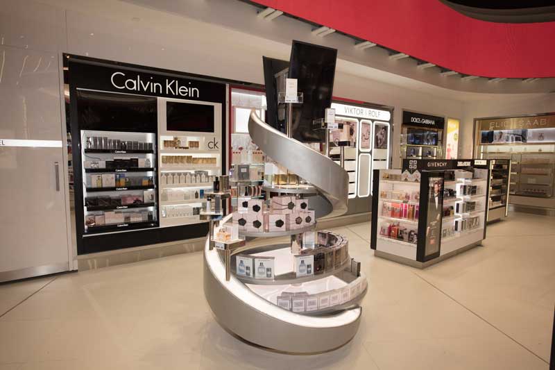
retail fit out

The Right Layout

Choose a layout that suits your products and customer behaviour. Grid, loop, or free-flow? Each has its perks. Grids are great for easy navigation, loops encourage exploration, and free-flow layouts offer a more relaxed browsing experience.

Strategic Placement

Put your star products where they’re most likely to be seen – eye level is buy level. Place high-demand and impulse buys near the front and checkout to catch those last-minute decisions.

Breathing Room

Don’t cram every inch with products. Leave some breathing room. Spaces, where customers can pause and contemplate their choices, make the shopping experience less overwhelming and more enjoyable.

Creating an Engaging Customer Experience

Retail is not just about selling products— it’s about selling experiences. Engage your customers’ senses and emotions to make their visit memorable. Interactive displays, product demos, and hands-on areas can transform passive browsing into active engagement. It’s about creating moments that make customers feel connected to your brand.

Think about what makes your store unique and amplify it. Whether it’s a cosy reading nook in a bookshop or a mini runway in a fashion store, find ways to give your customers an experience they’ll remember and talk about.

Interactive Elements

Add interactive elements like touchscreens, try-out areas, or customisation stations. These not only entertain but also provide valuable information about your products, making the shopping experience more personal and engaging.

Sensory Appeal

Play with textures, scents, and sounds that resonate with your brand. A sensory-rich environment can significantly enhance the shopping experience and leave a lasting impression.

Personal Touch

Train your staff to offer personalised recommendations and assistance. A friendly chat or a helpful tip can make a world of difference in creating a positive, memorable shopping experience.
commercial fitouts melbourne

The Impact of Professional Layout Design and Fitout

Alright, here’s where things get real. A pro touch can elevate your store from just another shop to a retail hotspot. Professional layout design and retail fitout aren’t just about making things look pretty— they’re about creating a space that works. 

It’s the difference between a layout that’s just okay and one that maximises every square inch for sales. Pros in retail shopfitting know how to balance aesthetics with functionality, ensuring your space is not only visually appealing but also practical and sales-effective. Investing in professional design and fitout is like fine-tuning your store to perform at its best.

Expert Insight

Professionals bring a wealth of experience and insights. They know what works and what doesn’t, helping you avoid costly mistakes. Their expertise can help you make informed decisions that pay off in the long run.

Tailored Solutions

Every store is unique. Pros provide tailored solutions that align with your brand, target audience, and business goals. They create a space that’s not just functional but also resonates with your customers.

Quality and Durability

Quality fitouts last longer and look better. Investing in professional services means you’re getting a setup that’s built to withstand the daily grind of retail, saving you money and hassle in the long run.